Categories
Art & Craft Art Journal

Strathmore Softcover Mixed Media Journal – Art Journal Reviews

It is not a secret that I love art journals and can never have enough. So in this series I am reviewing all the art journals that I have used over the years. Some are firm favourites that I buy again and again, some have their quirks and some are straight up don’t-buys. Keep reading to find out more about:

Strathmore Softcover Mixed Media Journal

I heard about Strathmore journals a lot in the mixed media scene (I think I first heard Donna Downey mention it in one of her videos), but they’re not available in the UK. Then I realised that I could easily order one from amazon.com and the shipping wasn’t too bad! I’ve only had this one a few weeks but it’s already become my absolute favourite journal I own! Keep reading to find out why.

11809523_1026621434024623_1631582921_n

Look & Feel

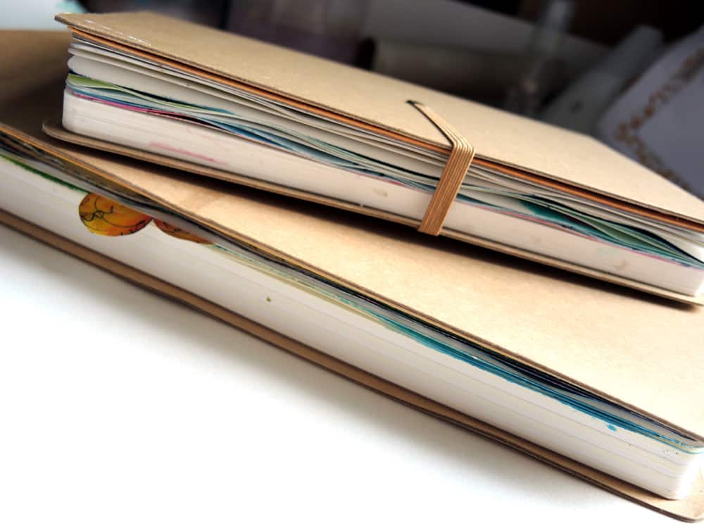
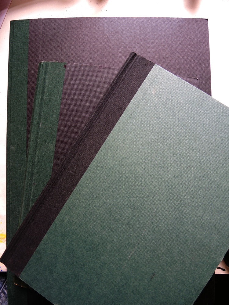
It has a soft floppy cover that feels very nice to touch. It got a bit damaged in transport; it has some grooves pressed into the cover material. I’ve heard other people mention something similar happened to theirs but it doesn’t affect its use at all. It’s 7.75×9.75″ and it feels like an ideal size to me (not so small to be fiddly, but not so big to be intimidating).

Binding

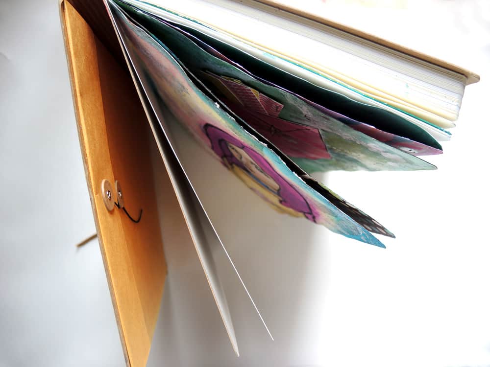
The binding is sewn and then glued. This means the pages don’t lie flat when you open it. That’s not ideal, but it’s something I’ve been able to learn to work with. One of the major advantages of this type of binding is that there is no bleeding! So to me it’s pretty much a direct tradeoff (lie flat vs no bleeding).

Strathmore Mixed Media Journal Review | iris-impressions.com

Paper Quality

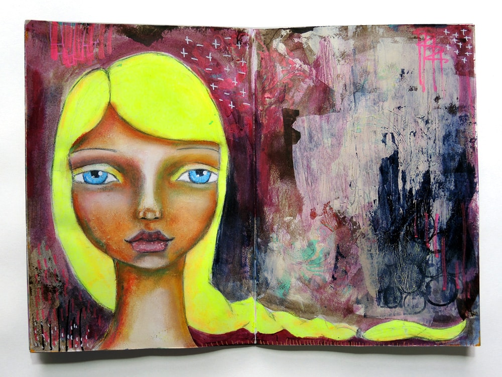
The paper is only 90lb/190gsm which sounds ridiculously thin. I normally wouldn’t touch anything that thin, thinking it would definitely not stand up to heavy and wet mixed media use. Surprisingly.. this is some of the best paper I’ve used. It can take quite a bit of abuse before it starts pilling and the pages don’t show any sign of buckling or rolling when you use wet media. The paper feels quite porous and velvety (when you use watercolours they feel like they kind of soak in and fan out a bit) which is a quality I really like.

Strathmore Mixed Media Journal Review | iris-impressions.com

Availability

This is a US journal and easily available over there both online and in stores. I don’t know any shops that stock it in the UK, but as mentioned the international shipping on amazon is very reasonably priced (just select the slowest shipping option & have patience!).

Price

This journal costs around $16. Including shipping to the UK it cost me around £16. Not exactly a bargain, but absolutely worth it for the quality. There are no other journals that I’ve used at this price point that tick so many boxes.

The Verdict

Strathmore do a specific line of paper for mixed media, which is what is used in these mixed media journals. It’s absolutely spot on and this journal is a joy to work in. I’ve dubbed it The Magical Journal! Everything I do in it I enjoy and I love all the paintings I’ve made in it! My only criticism is that the pages don’t lie flat. Next time I will try the hard cover version in the mixed media journal range, as that one does lie flat.

Strathmore Mixed Media Journal Review | iris-impressions.com

Disclosure of Material Connection: I have not received any compensation for writing this post. I have no material connection to the brands, products, or services that I have reviewed.

If you’ve used Strathmore mixed media journals yourself and would like to share your opinion please do leave a comment below!

Categories
Art & Craft Art Journal

Stillman & Birn Zeta Series – Art Journal Reviews

It is not a secret that I love art journals and can never have enough. So in this series I am reviewing all the art journals that I have used over the years. Some are firm favourites that I buy again and again, some have their quirks and some are straight up don’t-buys. Keep reading to find out more about:

Stillman & Birn Premium Sketchbooks & Journals – Zeta Series

A while back in my search for ‘the perfect art journal’ I was asking around online for recommendations. The Stillman & Birn range was mentioned several times. I ordered one from the US and I couldn’t wait to try it out! I’ve been using it for about 5 months now (and it’s nearly full), so keep reading to find out what I think of it.

IMG_6439

Look & Feel

It feels quite premium with a hard black cover that is slightly textured. It’s about A5 size (I have the 5.5×8.5″ one). Because of the size & sturdy cover it feels like something you could easily chuck in your handbag without the pages getting damaged.

Binding

This has a sewn binding of several signatures. Between signatures there is sometimes quite a big gap. This can be annoying if you’re using those pages as a spread, as there will be a big gap between the left and the right page.

Stillman & Birn Sketchbook Journal Review | iris-impressions.com

Paper Quality

The paper is heavyweight 270gsm hot pressed (smooth) watercolour paper. The website describes it as being suitable for Dry & Wet Media, Watercolor, Ink. To me, the paper is the singlemost important thing when buying (and rebuying) a journal. This paper really disappoints. The paper is very smooth but extremely weak. It pills easily when you go over it more than once or with a brush that is any firmer than a watercolour brush. This could be fixed by gessoing the pages first, but for me the whole reason for buying something with heavyweight HP paper is to not have to use gesso. Due to the problem with the paper the only thing I can use this journal for is watercolour, not mixed media as I intended.

Stillman & Birn Sketchbook Journal Review | iris-impressions.com

Availability

This is a US journal and easily available over there. In the UK it is stocked by some suppliers (try Jackson’s Art Supplies), but sometimes they are out of stock awaiting an overseas order. I had to wait about 1 month for mine.

Price

I paid £12 for this journal, which makes it comparable to the small Dylusions journal. It’s not super expensive but not cheap either. For this price I expect a good quality journal, but due to the problem with the paper I find this to be too expensive for what it is. It might be better value if you’re in the US.

Stillman & Birn Sketchbook Journal Review | iris-impressions.com

The Verdict

These journals are specifically marketed for mixed media, but I wasn’t able to make it work. Customer service from Stillman & Birn got in touch with me to give me some tips and help out, but I still wasn’t able to work in it in my own natural style. If you are looking for a watercolour-only journal then this might become your favourite journal. I personally hate being restricted to one medium, so I will not be buying this journal again. I might consider trying the Beta or Delta series instead (same paper weight, but cold press finish) to see if the paper stands up any better.

Stillman & Birn Sketchbook Journal Review | iris-impressions.com

Disclosure of Material Connection: I have not received any compensation for writing this post. I have no material connection to the brands, products, or services that I have reviewed.

If you’ve used Stillman & Birn journals yourself and would like to share your opinion please do leave a comment below!

Categories
Art & Craft Tutorials, Guides & Advice

5 Tips To Develop Your Unique Art Style

Ask any starting artist and this is pretty much the holy grail, the thing they’re looking for, the elusive concept, the thing that excites them and the thing that makes them despair….:

Developing your own style

I’ve been doing this art thing fairly seriously now for 2 years, and I still struggle with this on a daily basis. I can see glimpses sometimes and other times I’m like an impatient child stomping their feet: WHEN is it FINALLY going to HAPPEN?

So, while I’m having my own little personal struggle here, let me share with you these five tips to developing your own art style. Follow these top tips and I promise you, IT WILL HAPPEN. Bit by bit, your style will start to emerge. You won’t even notice it, but when you look back it will be there. All of a sudden people will say things like ‘I love your style!’ or ‘I knew that painting was yours!’ or you will recognise yourself the elements that make up your personal style.


Tip 1: Create A Series

Creating a series of paintings is a great way to hone your skill and practice doing the same thing but differently. Ways of approaching this could be to pick a certain colour scheme to work in and with a certain theme or subject. For example creating four paintings of doves and/or using the same 3-4 colours in each painting. You could also do something more abstract with a similar colour scheme and similar shapes across the pieces.

When creating a series it can be helpful to work on all paintings at the same time. This will help make things easier with achieving consistency across the paintings.


Tip 2: Do A Challenge

The thing that kickstarted my creativity big time was joining the Art 101 challenge . I joined a group of people who were all going to complete a certain number of paintings within 101 days. Having an achievable goal in mind and a timeframe within which to do it can be great motivation. Practice and simply DOING IT is such a big part of developing your style, and doing a challenge really helps you get down and do it. Get together with other people to support each other and hold each other accountable.

Formats you can consider for challenges are things like: create x number of paintings in y days / 10 minutes of sketching every day / draw one face a day for 100 days


Tip 3: Notice Your Likes & Dislikes

What is it you enjoy drawing or painting? Are you really drawn to certain subject matter, shapes or colours? You can analyse your own work and then build on it. If you see yourself doing and enjoying certain things, start amplifying those things and do them consciously.

For me I LOVE creating faces. Then within the faces I notice more things that I like doing, like where I enjoy placement of the features (e.g. mouth low in the face, nearly no chin) or what shape eyes I like to paint.

This can also relate to certain types of art supplies or techniques. Anything that you love working with and would like to do again and again.

Conversely if you notice yourself not enjoying things, then don’t feel like you need to do them. Don’t create the expectation that your work needs to include elements or techniques that you don’t actually enjoy. For me that might be lots of doodles or trying to make things very realistic.


Tip 4: Develop Your Personal Imagery

We all have our own personal story. Certain subjects or symbols might deeply resonate with us and it is helpful to sit down and have a think about that. These could be shapes, symbols, animals, plants, flowers etc. Anything that has a personal symbolic meaning to you could become part of the imagery that you draw from to create your paintings.

If you look at famous painters they usually have a very strong visual language. This is partly the thing that makes their paintings recognisably theirs.

It can be helpful to compile a list of 5-10 things that are meaningful to you and that you want to have show up in your art. You can then even practice sketching them. For me a few recurring symbols are: teardrops, cypress trees/cat tails, spirals, crowns, rectangular buildings, blushing faces, sun bursts.


Tip 5: Study The Masters

Copy, copy, copy! Copying an existing work of art (this is called a study, and remember to ALWAYS give credit, whether the artist is super famous or whether it’s your next door neighbour (who may or may not be famous)) is an excellent way to practice technique.

Take a step back and analyse the different parts of the painting. Ask yourself how you would recreate something and how you would deviate from it if you were doing things ‘your way’. Set yourself a challenge to recreate someone else’s painting, but giving it your own spin (take your knowledge from the tips above).


Your style is within you. It’s waiting to emerge, but it needs practice and encouragement. It will develop, it will come out. Keep making art, keep showing up, keep sharing, keep on being you!

If you’re looking for more guidance to develop your own style, you’ll love Radiant: Art Journals. 15 teachers have prepared wonderfully in-depth lessons for you so you can spread your own creative wings in the safe space of your own art journal. I hope you will join us!

Are you looking to find your own art style? What is it you struggle with? Or are you a more established artist who has gone through this? What is your top tip? Share your thoughts with us below!

Categories
Art & Craft Art Journal

Seawhite of Brighton Journals – Art Journal Reviews

It is not a secret that I love art journals and can never have enough. So in this series I am reviewing all the art journals that I have used over the years. Some are firm favourites that I buy again and again, some have their quirks and some are straight up don’t-buys. Keep reading to find out more about:

Seawhite of Brighton Sketchbooks & Journals

Seawhite of Brighton is a brand that encapsulates a range of art supplies. They are most well known for being super affordable and creating paper that stands up to wet media. In this review I’m focusing on the ‘Starter Stapled Sketchbooks’, although as far as I know the paper used across the range of sketchbooks is the same, it’s just the binding & format that differs.

Into The Woods | mixed media in art journal | iris-impressions.com

Look & Feel

It looks cheap & cheerful. Very simple, kind of like a school notebook but unruled. The cover comes in several different colour options.

Binding

As the name suggests, the binding is created with staples. Two staples hold one signature of paper together. Using staples for binding feels cheap, and yet I can’t fault it. While working in this journal I’ve never wished for different binding or found it was lacking in some way. There is some bleeding due to the binding, but it’s not much different from journals that are bound differently or more expensively (I have yet to find a journal that doesn’t bleed through the spine).

Seawhite of Brighton Art Journal | iris-impressions.com

Paper Quality

The website describes the paper as ‘140gsm all-media cartridge paper, extra wet strength’. It’s the extra wet strength that is important. The paper definitely stands up better than other paper with a similar weight. I’d usually recommend going to at least 200gsm for heavy or wet mixed media use, but this journal can take it up to a point. The paper quality is surprising for the price point and the weight, but it does have a tipping point.

Seawhite of Brighton Art Journal | iris-impressions.com

Availability

This is a UK made journal and is widely available in the UK and as far as I know they are also well stocked in mainland Europe.

Price

The first time I saw the price on this journal my eyed about popped out of their sockets, it was £1.25 (about $1.90) for the A5 size. What??? It makes this journal incredibly affordable, a no brainer.

Seawhite of Brighton Art Journal | iris-impressions.com

The Verdict

The price is the biggest deciding factor in my love for this journal. It’s so ridiculously cheap, it makes me much more forgiving than I would be of a more expensive journal. I can get loads of these, experimenting with sizes, without feeling guilty. I’m always pleasantly surprised at the decent quality. Having said that, the paper does pill if you keep going at it and there is a fair amount of buckling (which I personally don’t mind because I just flatten the pages afterwards). Due to its size it’s a great journal to take with you and because it has a low number of pages (40) it’s satisfying to be able to fill up a journal quickly!

Overall it is not ‘the best’ journal for me, but because of price in relation to quality it’s one I buy again and again, definitely a staple (har har, see what I did there?).

Seawhite of Brighton Art Journal | Mixed Media Art | iris-impressions.com

Disclosure of Material Connection: I have not received any compensation for writing this post. I have no material connection to the brands, products, or services that I have reviewed.

If you’ve used Seawhite of Brighton journals yourself and would like to share your opinion please do leave a comment below!

Categories
Art & Craft Tutorials, Guides & Advice

5 Reasons You’re Not Happy With Your Art Journal Pages

photo credit: Broken Flowers via photopin (license)

I know very well what it’s like to want to do art, but every time you sit down and do it, you’re feeling crappy about the result. It’s really inhibiting and it might even stop you from creating next time. I don’t want that for you (or for myself)! So here are some insights that might help you understand why this happens and what you can do to change it.


1. You need practice

There is no way around it: practice makes progress. There are no shortcuts and you have to put in the time. Imagine you’re going to learn a language, it will take some weeks to grasp the basics, quite a few more to be semi-proficient and several years to be fluent. The more you practice making art, the more fluent you become and the easier it will be for you to create things you like, simply because of your skill level.

I love this quote:

Never compare your beginning to someone else’s middle
-Jon Acuff

Another awesome resource is this video with words from Ira Glass. It’s called ‘The Gap’ and is about that ‘gap’ that exists between knowing what art you find beautiful and actually being able to achieve it yourself.


2. You are attached to the outcome

Leading on from the concept of ‘the gap’ explained above, it’s very frustrating if you have something specific in mind and aren’t quite able to execute it as nicely as you see it in your imagination. This partly comes back to practice, but another thing that you can try which to me absolutely transforms the process of art making is: to let go of the outcome.

Art is weird and wonderful, it’s a process, not just paint by numbers. Try and place yourself firmly in the current moment, rather than in the future where this finished (perfect) artwork exists. What can you do now that you enjoy, that is an expression of yourself? Let the art emerge from moment to moment, rather than working towards a fixed outcome.

An example of this might be that you are going to paint a portrait. But instead of trying to make it picture perfect or photo realistic, let it come alive through your personal filter of your mind, hands & body. This is actually where the most original art comes from in my opinion!


3. You need to add more detail

One of the things I notice a lot in the art of beginners is that it somehow looks unfinished or unrefined. It’s not necessarily a lack of technical skill (I think beginner’s art can have a great sense of freedom! As well as art made by kids) but a lack of going back in and making things look complete. It’s probably also to do with confidence. I see this in how people shade faces, they know where to put the shadows and the highlights but they’re not confident enough to make it BOLD. Make the darks really dark and let the highlights pop out!

You’ll be surprised at how a painting can transform by just paying a bit more attention to the details and finishing touches. Pay attention to shadows/highlights, use outlines and shading, create halos around people/objects, add little doodles or dots.


4. You’re working against your supplies

There are no rules about how you must use your art supplies (or which specific supplies to use), but there are definitely ways in which to use them effectively and ways in which to use them that make you want to scream and tear your hair out!

You’ll have to experiment yourself with specific things that feel frustrating that might be solved by a different technique (try Googling or a search on YouTube!), but here are some things that I’ve found frustrating and ideas on how to make them better.

Paper pilling (rubbing off / forming little balls):

-Use gesso first or a layer of acrylics. Make sure this layer is thoroughly dry before continuing

Paint not applying smoothly:
-Dilute slightly with water or matte medium/PVA glue
-Work BIGGER! Tiny fiddly work is especially hard when you’re a beginner. Scale up and then when you’ve gained experience, scale down again
-Use different or better quality brushes

Backgrounds look muddy or brown instead of vibrant (also especially applicable while Gelli printing):
-Try not to mix complementary colours (blue/orange, purple/yellow, red/green)
-Only apply either cool colours (blues/greens/cool purple) or warm colours (red, yellow, orange) together.
-Dry thoroughly in between layers.


5. You’re doing the wrong thing

Why are you doing this? Whose art are you making? I often fall into the trap of seeing other people’s art and admiring it so much that I want to recreate it or I want my art to look like that. So off I go on a very results orientated journey, which I often find very frustrating and unfulfilling. So ask yourself what your goal is. How do you want to feel? What do you really want to make? How do you like using your supplies? Why do you want to create art in the first place?

There are no right answers to these questions, just your answers that will give you an insight into your personal whys and hows.


If you’ve got any tips to share, please post them below in the comments! Can’t wait to hear what your favourite methods are for enjoying making art.

Categories
Art & Craft Art Journal

The Dylusions Journal By Ranger – Art Journal Reviews

It is not a secret that I love art journals and can never have enough. So in this series I am reviewing all the art journals that I have used over the years. Some are firm favourites that I buy again and again, some have their quirks and some are straight up don’t-buys. Keep reading to find out more about:

The Dylusions Journal by Ranger

This is the journal developed by Dyan Reaveley from Dylusions and is said to be specifically suitable for using the Dylusions spray inks with. I bought the large size a while back to do some Life Book lessons in, and more recently bought the smaller one as it fits nicely in my handbag and was also on the supply list for Art Journal Summer School.

Dylusions Journals https://iris-impressions.com/2015/09/the-dylusions-journal-by-art-journal-reviews/

Look & Feel

This is a very pretty art journal. A lot of thought has obviously gone into the design. I love the brown cover and the way it has an elastic strap to keep it closed. It also has an envelope inside to keep small bits in.

Binding

The cover is separate from the ‘notebook’ that is actually glued inside. This means that you can open the journal flat rather than having to bend the spine. In the big version of the art journal I’ve had some issues with the binding with the area of paper near the spine getting quite weak (& tearing) when the paper is wet. There is bleeding through to other pages if you use wet media near the spine.

Dylusions Journals https://iris-impressions.com/2015/09/the-dylusions-journal-by-art-journal-reviews/

Paper Quality

The large version comes with two types of paper (the signatures alternate between the different paper types): manila cardstock and matte white heavy cardstock. The smaller journal has the white cardstock throughout. The paper is nice and smooth. When turning the pages you get a feeling they are quite thin. I like to work with a lot of wet & heavy media and I don’t feel the paper is quite a match for that. Especially in the bigger journal the pages are prone to tearing near the spine if you use wet media. The paper is also prone to pilling if you don’t use a layer of gesso or acrylics beforehand.

Availability

This journal is fairly unique in that it has good availability both in the US and the UK. Hurrah!

Dylusions Journals https://iris-impressions.com/2015/09/the-dylusions-journal-by-art-journal-reviews/

Price

The price is reasonable but not cheap. I feel like you’re paying over the odds to get a nice design and the Ranger/Dylusions brand name, but the overall quality could be better. The smaller journal feels worth it to me, but the bigger journal is expensive. If you’re in the UK and looking for an A4 journal I’d spend the extra £8 to get a Roberson’s Sketchbook instead.

The Verdict

The elastic band is prone to snapping. This has happened to my big journal and I’ve heard a lot of people mention the same thing. It’s not a big deal, but it does feel like a design flaw seeing as it seems to happen to a high percentage of journals. If you’re a very heavy mixed/wet media user then this might not be the journal for you due to the paper not really holding up to it. For more light mixed media use this is a good journal, and the paper does make the Dylusions inks look nice and bright. I’d rate the big journal slightly lower (more like a 6.5/10) and I won’t be getting another one of those. I will most likely get the small journal again.

Disclosure of Material Connection: I have not received any compensation for writing this post. I have no material connection to the brands, products, or services that I have reviewed. This post contains affiliate links to art courses that I recommend.

If you’ve used the journals yourself and would like to share your opinion please do leave a comment below!

Categories
Art & Craft Art Journal

Art Journaling – There Are No Rules

I often see people asking ‘how do I art journal?’ or sometimes I see people lamenting that they ‘don’t have the right supplies/skills for art journaling’. I have good news friends! With art journaling THERE ARE NO RULES!

The definition of what an art journal is is such a broad one. It’s literally any type of art or mark making in something that vaguely resembles a book. OK that’s it, this post is done now…. *grins* I kid, I kid. Keep reading =p

Love starting a new art journal! Especially after filling a previous one, feels like a reward! Sketch with a Pitt pen while at the park yesterday, filled in with watercolours at home. #watercolour #schmincke #artjournal #artinthepark #whimsical #artoninstagram #irisimpressionsart
Watercolour & pen. Simple art journaling in the park.

The reason I’m writing this post is because I want to open up this world of art journaling for you, and give you permission to have your own unique art journal. It doesn’t have to look like anyone else’s and there are no special skills, supplies or club memberships that are required for you to start.

It’s true that when you look at the well known art journalers out there, it can seem like there is a certain style and certain supplies that define art journaling. To me they are simply trends.

Art journaling or ‘artists journals’ actually go back in history a long time. An artist might have kept a journal to make notes, do sketches, work on ideas for paintings, collect clippings, experiment with colour etc. The type of art journal I keep is a safe space for self-expression and self-discovery.

Today has been an art filled day. #mixedmedia #intuitiveart #artstagram #artjournal #irisimpressionsart
Mixed media. A spread to process feelings.

Have a think about what an art journal means to you. Perhaps you’d like to have more than one art journal for different purposes? You could give an art journal a theme. You could explore your dreams in one journal and practice drawing faces/birds/flowers in another one.

In terms of techniques and art supplies: start where you are and build from there. The potential for art and self-expression lies inside you, not inside the materials.

5 minute texture play, nom nom nom! (yes I know you can't eat it....) All you need is a dirty #gelliplate a brayer and an old credit card! #mixedmedia #artjournal #irisimpressionsart #gelliprinting
Limited supplies. Creating a background with only acrylic paints and some texture tools.

Art supplies are soooo exciting and it can be easy to think you ‘need’ the next hottest thing that everyone is talking about. It’s never worked for me but ymmv. The things I’d recommend getting (if you really do not have anything yet) are staples like acrylic paint (craft paint is cheap and you can do great things with it!), black & white pens (Uniball Signo and/or Uni Posca are nice for working over the top of mixed media backgrounds) and a set of student grade brushes. Maybe a set of (watersoluble) crayons or pencils. Buy what you can afford. Use the stuff you have before going out and buying the next shiny thing.

Then comes the most important thing: go and create!

Try not to be held back by the ideas in your head of what art journaling ‘should’ be. Do what it is to you. If you need some ideas to get started, go and grab my free Get Inspired PDF.

This article was inspired by Felicia Borges and her concept of Art Journal Rebellion. Check back here on 24th August to read an interview with Felicia.

Categories
Art & Craft Art Journal

Roberson Watercolour Sketch Books – Art Journal Reviews

It is not a secret that I love art journals and can never have enough. So in this series I am reviewing all the art journals that I have used over the years. Some are firm favourites that I buy again and again, some have their quirks and some are straight up don’t-buys. Keep reading to find out more about:

Roberson Watercolour Sketch Books

This is currently my go-to art journal when I want to work big (A4 or A3). You may have heard of this journal via Tamara Laporte from Willowing.org who also recommends this as one of her favourite art journals.

Journals02

Look & Feel

This feels like a serious art journal and is quite heavy. It’s quite no-frills with no indication anywhere on it what brand it is or what it is made of! For a few years I didn’t even know the name of this elusive journal. The colour of the covers and spine indicates what type and weight the paper is. This journal comes in A5 (landscape), A4 & A3 (portrait).

DSCN7507

Binding

It has a robust thick cardboard cover with a linen strip on the spine. The binding is really solid: I am a heavy mixed media user in my journals and it stays together really nicely. When you open it the pages don’t quite lie flat and once you get to the final pages there can be a bit of a ‘drop’ between the left and the right page. There is some bleeding through the binding from one page to the other corresponding page in the same signature if you use very wet media.

DSCN7505

Paper Quality

This journal comes in different paper types and weights. I really like hot pressed (smooth) watercolour paper so I have used the 300gsm (black cover with green spine) and 190gsm (green cover with black spine). The thicker paper is excellent for heavy mixed media use, but it is very rigid. The thinner paper also stands up extremely well to mixed media and lends itself a bit more to leafing through the book. The 190gsm version has more pages than the 300gsm (54 vs 34) so by the time the journal is full the one with more pages will probably ‘fan out’ quite a bit wider.

I have been told that these journals are made from Saunders Waterford paper. This paper is quite smooth (not as smooth as some other HP watercolour paper I’ve used) and extremely robust. It takes all sorts of media very well, there is some curling while working wet but it can be straightened/pressed when dry. It also stands up to more abrasive application of paint: brayering, scrubbing etc. The paper stays put and doesn’t rub off.

DSCN7504

Availability

Update 21-Feb-21: Unfortunately this journal has been discontinued and is no longer available. However, the paper (Saunders Waterford) is widely available and could be used to make your own journal.

So far I have only heard of this this journal being sold in the UK and it’s a bit hit & miss with regards to where you will find it locally. Smaller (fine) art shops are more likely to stock it than bigger stores. In London you can buy it at Cornelissen (Bloomsbury) and Shepherds (Victoria), they also sell them online. You can do a Google search for ‘Roberson Watercolour Book‘ to find more options to buy.

Price

In terms of absolute cost this is an extremely expensive art journal. Prices range from approx £22 ($34) for the A5 book to nearly £50 ($78) for the A3. However, they are definitely worth that money due to the good binding and absolutely superb paper quality.

DSCN7506

The Verdict

I love this art journal. It is probably one of my favourites ever. The fact that I have filled one and have bought the same one again should be a testament to that. For me the only places it is not ideal is in terms of format (I’d love an A5 portrait orientation one – unfortunately the A5 only comes in landscape) and price. If you can/want to afford this journal you will not be disappointed.

Disclosure of Material Connection: I have not received any compensation for writing this post. I have no material connection to the brands, products, or services that I have mentioned.

Categories
Art & Craft Musings

Embracing Your Inner Darkness

I’m afraid of my inner darkness. That might not be a very surprising statement, because I don’t know many people going around declaring how much they luuuuuuuurve their dark stuff. (Other words for this might be inner demons, or issues, or icky stuff, or what do you call it?)

I had a realisation the other day though: I have this wonderful platform for exploring my darkness in a safe place.

ART

And yet I don’t. I’m afraid of what might come out. I’m afraid it might not be pretty. I’m afraid I’ll sit down with the intention to connect with some darkness and then for nothing to happen because I don’t even know HOW to do it.

You may have noticed I like to draw pretty faces. Or cute whimsies. I love stuff that looks pretty, cute and colourful. It’s definitely the type of art I enjoy looking at (as evidenced by my Pinterest). I actually even enjoy creating cute & pretty stuff.

It’s not like I don’t like what I create, but when I think about it, I might not feel a deep satisfaction with what I create lately.

This is kind of funny, because a while back I broke through the block of not enjoying the result of what I created (can you say: inner critic?). Then a while after that I broke through the block of not enjoying the process.

And now I’m finding there is another block to encounter & work through. It’s scary, but it’s actually also exciting! It sends such a strong message to me that this is a journey. That whatever we learn and learn to deal with, we’re never done because there’s always MORE. It keeps life (and art!) from getting boring.

So I’m going to be digging in. Trying to access and let flow the scary stuff. Let my own intuition and inner landscape guide me.

Are you with me? Ready to face the scary stuff in a safe space?

Half the time I don't know wtf I'm doing, but I think I have this wish to display to the world that I've got it all figured out. That stuff I do is intentional, you know, with purpose. But I realise I hide behind it. That I pretend even to myself that I know all the steps. It's the really letting go that I'm scared of. On this spread I'm trying. But it's still actively TRYING rather than just LETTING or BEING. It's so scary. It's so exciting. I just want to stick with it and see where this journey takes me. #intuitiveart #lettinggo #artismyteacher #mixedmedia #artjournal #irisimpressionsart

Flowers Grow Out Of Darkness | mixed media in A5 art journal | www.iris-impressions.com @rrreow

Pink Hills | mixed media in A5 art journal | www.iris-impressions.com @rrreow

Categories
Art & Craft Musings

If You’re Scared Of Making Art

This is for you if you’re feeling scared or intimidated about making art. If you’re having trouble getting started. If you get so deep into the not-good-enough-itis that creating seems impossible. If you need some gentle loving encouragement.

(I recorded this video for Rainbow Journal students, but I thought this might benefit everyone who struggles with these things. You can still sign up!)

So, you know you want to create, but that doesn’t mean it’s easy. Lots of things can hold us back.

I remember a few years back when during the day at work I’d think constantly about making art, I was overflowing with ideas. Then when I was back at home at my art desk I would be totally paralysed, all the ideas were just gone and I’d end up just watching TV all evening. It wasn’t very satisfying, but the fear was real and hard to deal with.

First of all, I want you to know that it is OK and I understand if you have obstacles or issues. You have some stuff you might not be OK with and need to work through, but YOU are OK and you are wonderful J Be kind to yourself. Take yourself by the hand as if you’re your own caring guardian angel who only wants the best for you and let’s explore the reasons you might be scared. That way you can understand what drives you and stop your fears from having such a hold over you.

Some fears you might be experiencing:

Fear of creating something bad or not being good enough

Hey, you are doing an ecourse! Yay you for taking a positive step to kicking this fear in the butt! You are allowed to practice! You’re allowed to be at a place where your art feels sucky and you’re allowed to get better. Please know that YOU are not your art. You are ALWAYS ALREADY good enough.

Fear of the blank page.

Hey, I’m gonna talk you through everything we do! The first step after creating our journal is painting the pages in bright colours, we won’t even have a blank page to deal with!

Fear of what we might learn about ourselves.

Maybe our dark feelings will come out? Maybe stuff will come up and we won’t know what to do with it? This is difficult, but please talk about it. With us as a supportive group or with the people around you who care. Learning about ourselves is always a good thing, that way things can come into the light rather than controlling us from under the surface.

Comparing ourselves.

So many amazing artists out there, how can we not compare? I love this quote: “Don’t compare your beginning to someone else’s middle” you are exactly where you need to be. You’re creating YOUR work. Own it!

Fear of criticism.

I think when we fear other people’s criticism so much that it stops us creating, we’re really scared of our OWN criticism. We criticize ourselves and when someone else does it too, we use that as a validation of our feelings which makes the criticism feel 10 times worse. You can find criticism everywhere (especially inside your own head), so choose to follow your path and create anyway.

Fear of creating something good.

It was a fluke right? I’ll never be able to repeat that! Or…. Try to let go of the outcome. That was that artwork… the next artwork is the next artwork. It doesn’t need to be compared, it just is.

Thanks for letting me yak about this! To me it’s actually one of the biggest and most important things, understanding what drives us, what holds us back and what steps we can take towards being on our true path of joy.

Thank you for listening and as parting wisdom let me reassure you that:

You are wonderful. You are enough.