Categories
Art & Craft Art Journal Tutorials, Guides & Advice Videos

Do It For Fun, Do It For You

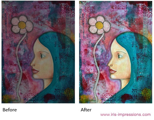
I’ve made 13 short art journal videos in the last 20 days. That’s a reason in itself to celebrate! But what it also gives me the opportunity to do is examine my ways of working, my habits and my reasons. And then to share these insights with you in the hope that you find it useful too!

The thing I’ve noticed most of all from doing a challenge in which I only spend 15 minutes on a page and from recording the process, is that I want art to be easy and fun. That’s also why I’m sharing these videos. The art making is for me, but the video making is to share and give back, because I so appreciate everyone out there who shares their process and helps people like me get inspired, be entertained and get better!

It would be really easy NOT to share these videos of quick pages. After all they’re not masterpieces, nor super in-depth tutorials, but I think the key to what they do have is that they are fun and lighthearted. I want to show that you can make something nice in 15 minutes, that you don’t need to take it too seriously, that it can be beautiful or it can be average.

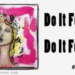
I think a lot of us feel held back by the thought that whatever we do (and especially whatever we share) needs to be somehow GOOD or MEANINGFUL. We think it has to be WORTHY. And then we attach a load of restrictions on ourselves in terms of what fulfills those criteria. What I’m saying is: it doesn’t have to be any of those things. Let go of the harsh judgements and requirements or the worry of what others may think, and instead do it for fun. Do it because it makes you feel joyful.

In sharing everything I attempt (even the messes and fuckups) I’m hoping that you get inspired to make art too and embrace the joy and let things be what they are. Let’s remove the pressure and let ourselves play!

Also, in case you were wondering, the days in November for which there are no videos are simply because I didn’t have the time or capability to film on those days, not because I’m filtering what I share.

Here are 3 of my favourite videos, and as a bonus the 4th video is the fuckup. Important! I call it a fuckup tongue in cheek. I am not feeling badly or being down on myself, I’m just being humorous because I don’t particularly like that page, but I see it as part of the process and I fully accept it and love it in its own way. I encourage you to do the same with your ‘oopsies’, love them and let go.


Day 19: Smudgy smudgy with oil pastels & oil bar


Day 5: Neocolor II and stenciling fun


Day 9: Drippy drippy inks


Day 12: A weird alien type person, wtf??

Categories
Art & Craft Featured Tutorials, Guides & Advice

How To Photograph/Scan Your Art And Prepare It For High Quality Art Prints

I wanted to share some tips with you all about how I create scans/pictures of my art and edit them in Photoshop. Below I walk you through the entire process I use to prepare my images to make high quality prints. Don’t forget to Share, Tweet or Pin this article if you find it helpful!

Photographing Your Art

Most of my art is too big or awkward for my A4 scanner, so I photograph it with my Nikon Coolpix P7800. Pretty much any digital camera will do as long as you make sure to set it to the highest quality & resolution. This amazing video by Tyler Stalman & Jason Eng created for Saatchi Online explains perfectly how to take good pictures of your art.

Using a tripod (or some other way to stabilise your camera) is essential. I attach my artwork to the wall with Blu Tack or picture hanging strips. I use a spirit level to ensure it is completely straight. I also make sure my tripod is leveled and the camera is straight. The more accurate you can be about this, the less you will have to ‘fix’ in Photoshop in terms of distorting the picture to make it fit.

I have a window on the left side of the wall which throws light, so I use a simple soft box light pointing at the painting from the right. You are trying to achieve equal soft lighting on the whole painting, no direct harsh light or shadows.

Using manual focus if your camera allows it is helpful. Nothing is more annoying than loading the pictures onto your computer only to find that they are not in focus or not everything is in equal focus.

Scanning Your Art

If your art is relatively flat and fits on your scanner it is preferable to use this method. You won’t be at the mercy of varying lighting conditions and a scanner will get great detail and every bit will be in focus.

Before scanning ensure the resolution is set to 300ppi. Depending on your scanner you may need to adjust the brightness and contrast. From the point of view of being able to adjust later in Photoshop, I prefer a scan that is slightly on the dark side over one that is too light. Adjust the brightness & contrast sliders and keep previewing until the preview matches the colours, detail & contrast of the original artwork. If you can, save these settings as a new profile so you can quickly access them next time.

Default Scan Settings & Adjusted Scan Settings. © www.iris-impressions.com @rrreow #scanningart #scanningartwork
On the left the default scanner settings, on the right with brightness & contrast adjusted. The adjusted scan is much more true to the original artwork. The default loses a lot of detail by being too bright and the colours are washed out.

Adjusting Your Art In Photoshop

I use Photoshop CS2, but any programme that allows you to adjust these settings will do. Editing in Photoshop is especially good for when you’ve photographed your art.

First I want to straighten up my art piece and make sure it fills up the whole canvas. I use the Rectangular Marquee tool to select as close around the artwork as I can, without cutting any of it off. Then I crop the image (Image > Crop). This may mean that on some sides the background still shows. To fix that, I use the Transform tool (Ctrl+T), and right click on the image and select Skew. I then drag the corners out where necessary. If you need to rotate your canvas with the transform tool (you shouldn’t have to if you followed the steps for straightening the artwork on the wall and leveling your tripod – it’s really worth doing!) do that before skewing.

Now we make the magic happen. First go to Image > Adjustments > Auto Levels. If it looks good, keep it. If it looks “WHOA TOO MUCH!” you can fade the effect by going to Edit > Fade Auto Levels and select a percentage. Then go to Image > Adjustments > Auto Contrast. Fade again if needed. Finally we use Image > Adjustments > Auto Color (and Fade).

Photo of Painting & Adjusted in Photoshop. © www.iris-impressions.com @rrreow #editingart #photoshop

How much you use these three tools depends on how true to life the pictures/scans you took are. Sometimes I hardly need to change anything, other times it makes a huge difference.

Save your picture at a high setting. I tend to go for File > Save As and then select jpg at Quality 12. There are other file types with less compression, but I’ve found there is no visually noticeable data loss with this setting and it keeps file sizes manageable.

Voila!

Now you’ve got your hi-res digital master to make prints of forevermore, even if you sell the original!

If you follow this tutorial please let me know in the comments, I’d love to know how you got on. If you have any questions I’ll be happy to answer them!